REGAL
Re-brand, 2017
Overview:
Regal Cinema has grown to become the 2nd largest theater chain in America. Since their foundation in the late 1980s, they have not updated their logo-mark to depict the innovations they are leading the competition in. With my process of their re-brand, I felt it was important to communicate what the movies are to a viewer.
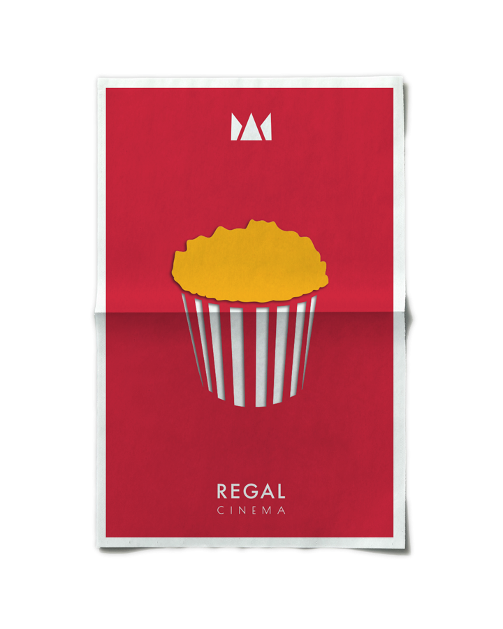
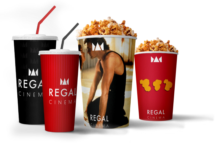
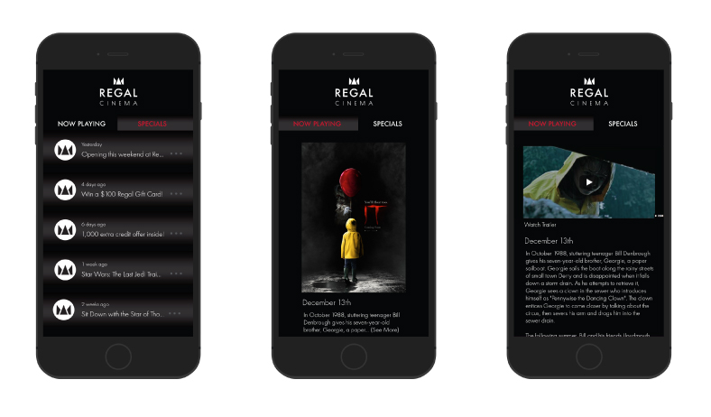
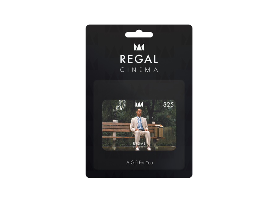
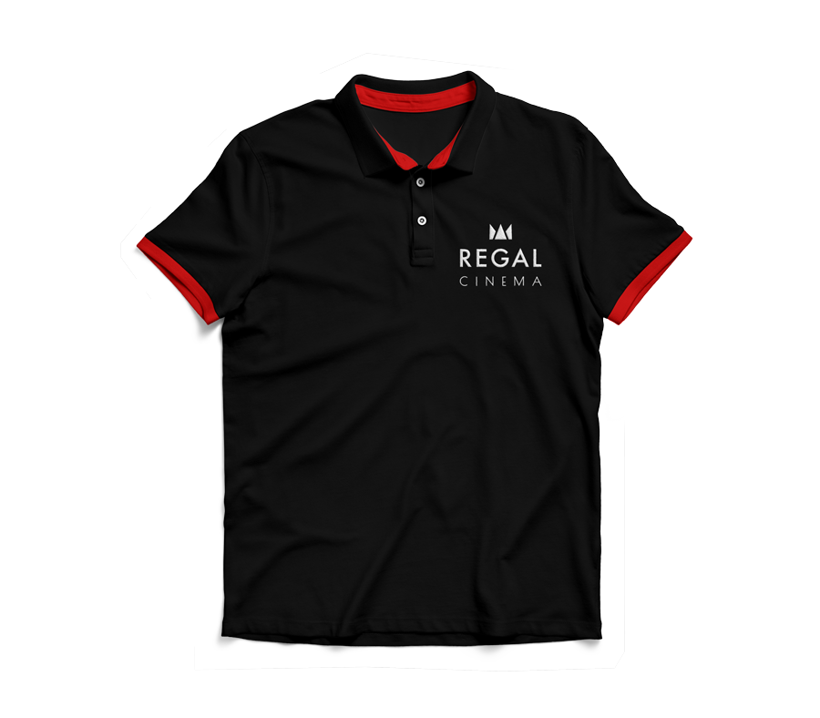
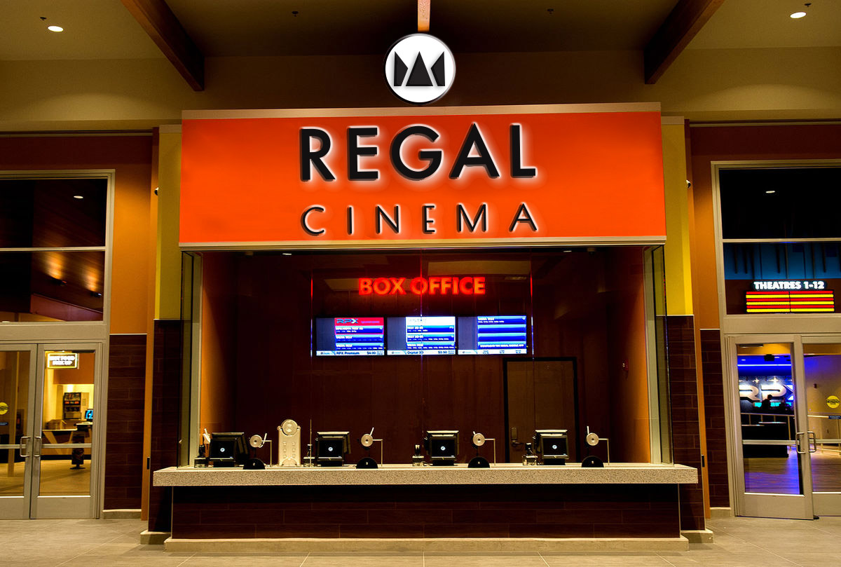
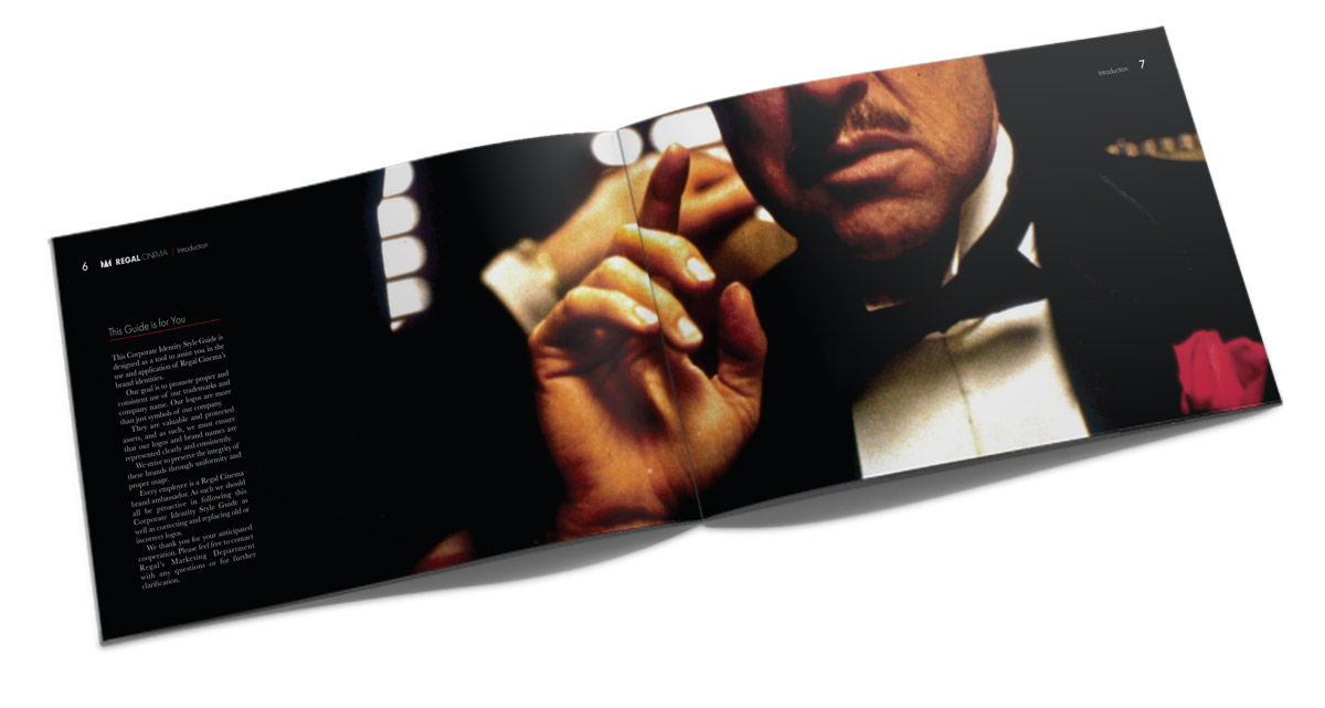
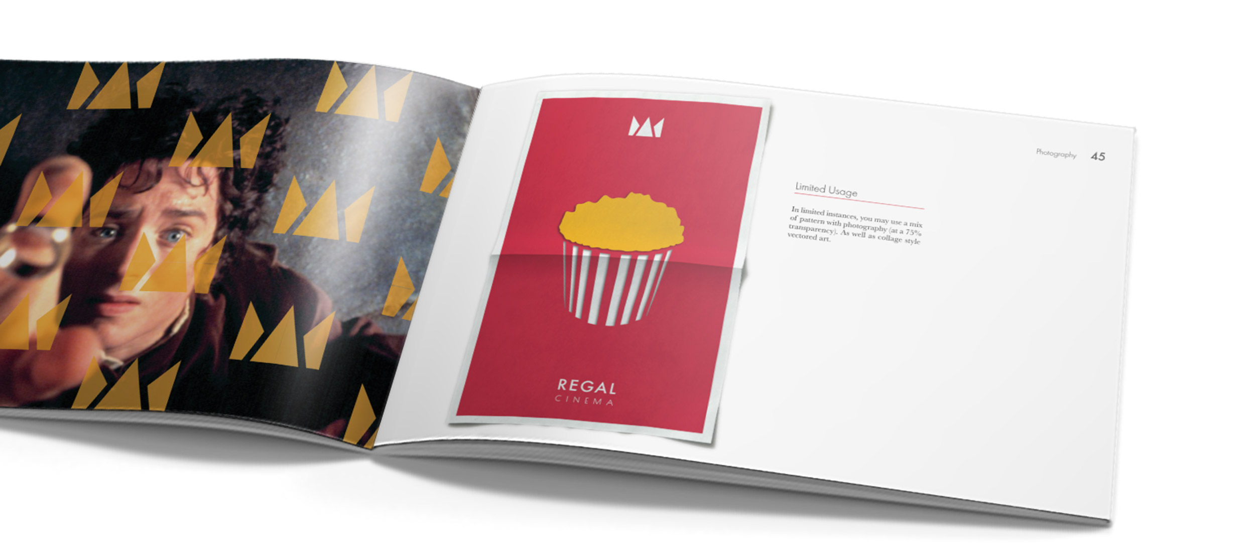
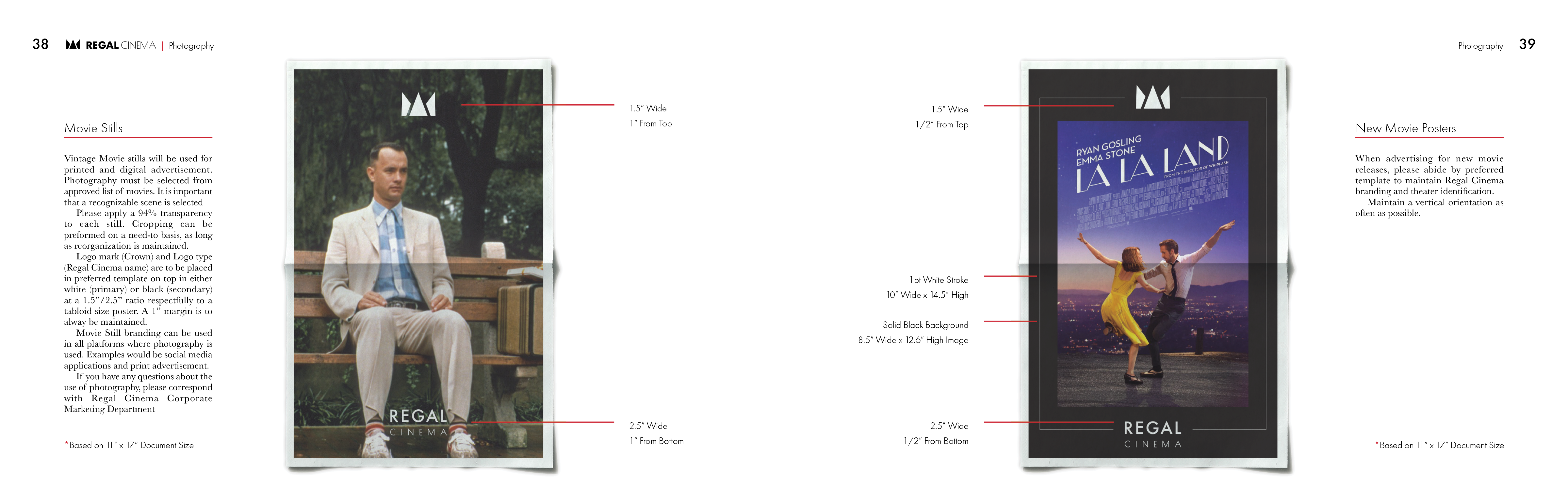
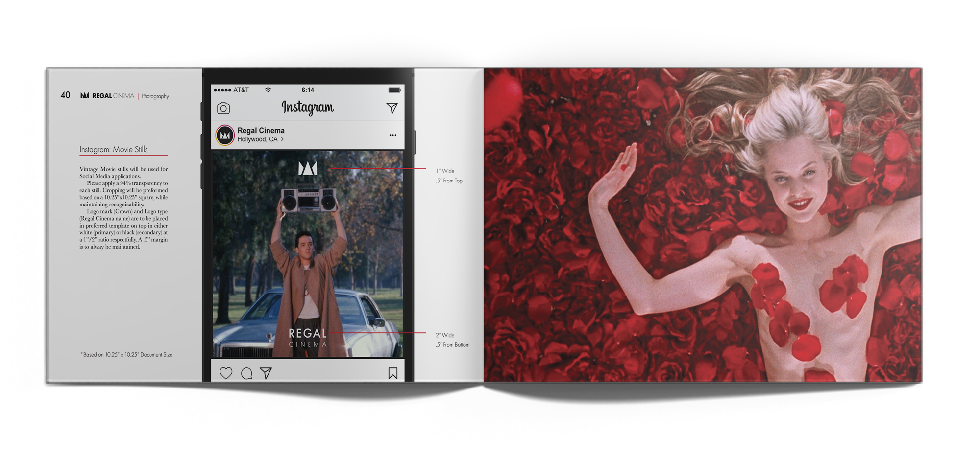
As a case study, I gave this theater, that was once stuck in its founding year, a new and modern facelift! The new primary mark is represented in black and white; while color, pattern, and photography is used as a powerful design accent. It is important that the logo stands alone, yet it does not distract from the emotion and nostalgia of the movies and movie viewing experience. Photography, especially, is one of Regal’s new branding's most important design element. The logo being a location reminder of where they can feel the emotion of each photo—at the theater! The over-all re-brand has given Regal an up-scale feel, with simplicity. Allowing the theater to do what it does best- create memories, emotion, and joy!
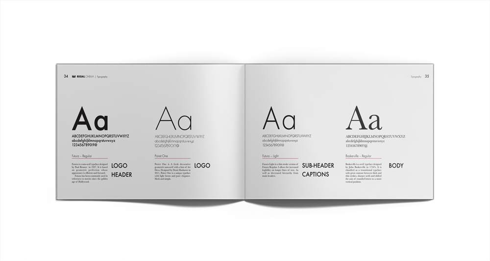
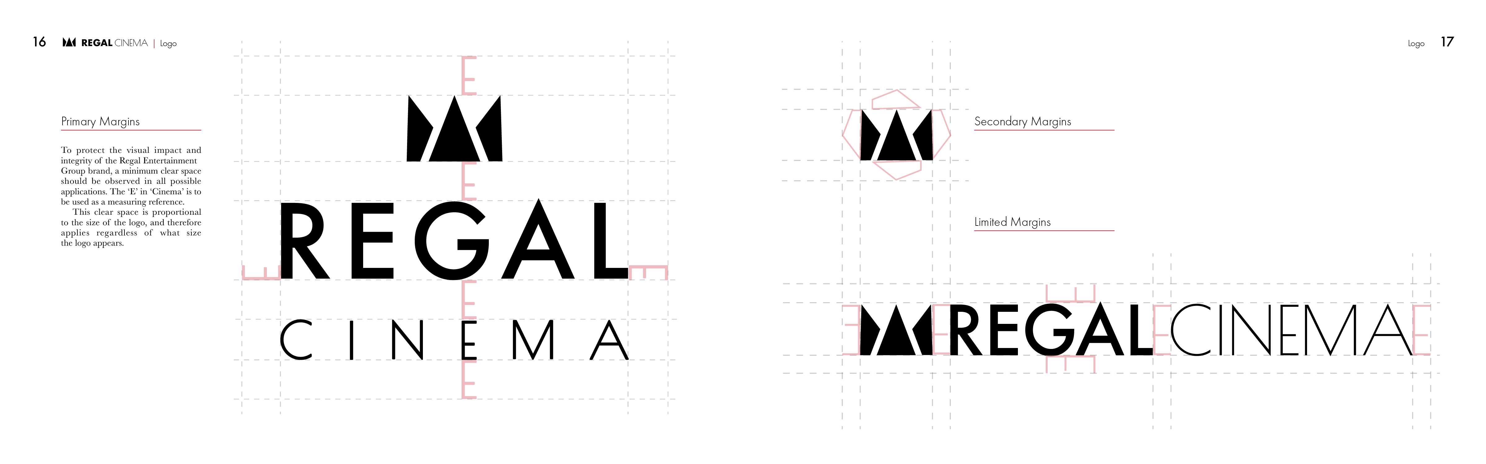
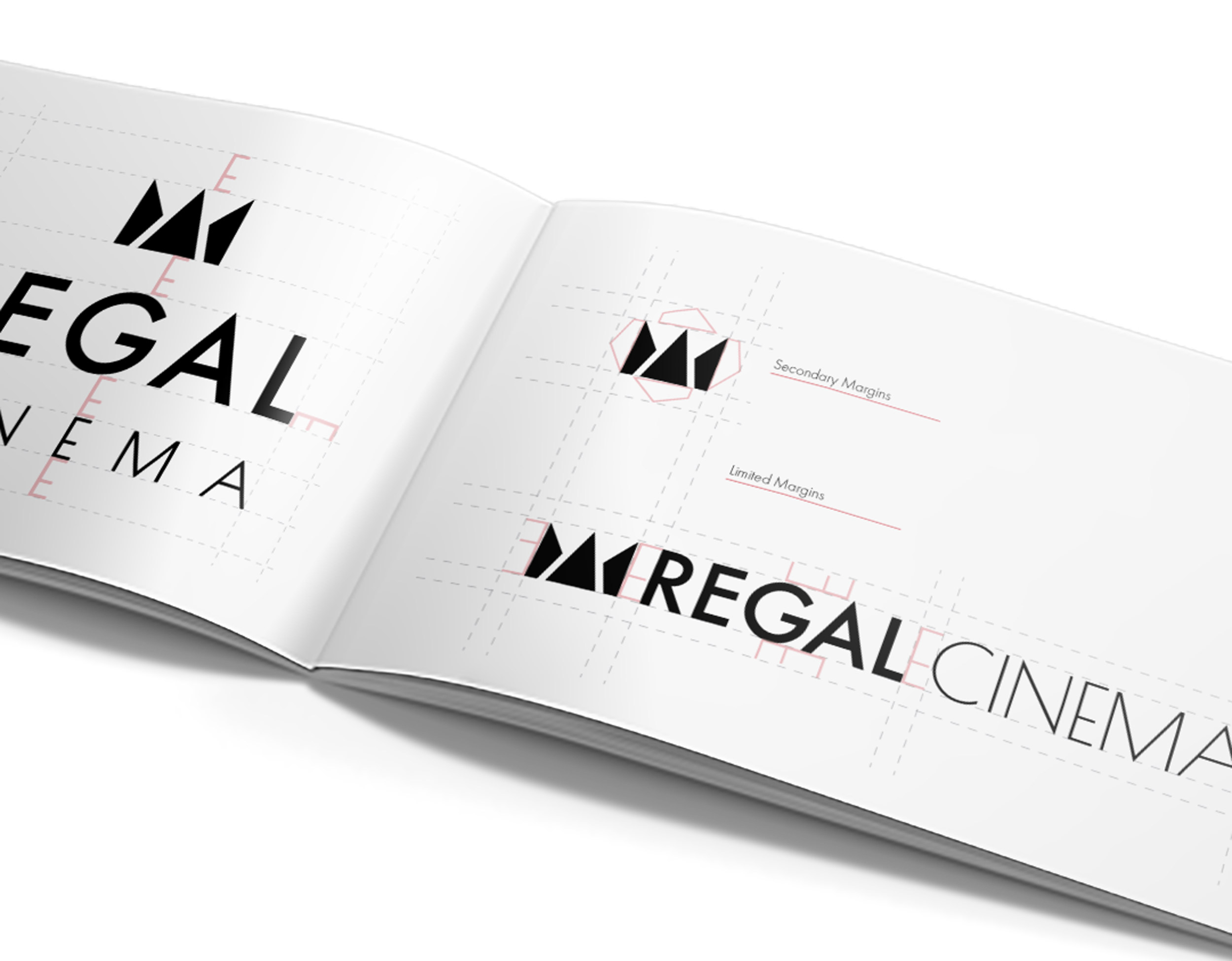
During this study, I tackled all elements of branding. From the initial brand audit, all levels of the brand briefing, to all the tactical work, including the logo and branding essentials, assets, and applications. As well as an 80 (plus) page style guide to educate on branding implementation.
Acting Roles:
- Creative Director
- Brand Director
- Logo Designer
- Graphic Designer